CITIZENM.DESIGN
Charlie CD’d the project and wrote the words.
Branding was instrumental to citizenM’s success. They Asked us to create a platform which would explain their brand ethos to the world and serve as an easy-to-access brand book for staff.
citizenM.design did just that. Split in two halves, the public side gave a potted history of the brand and highlighted important details, while the password-protected side gave access to full guidelines and asset libraries.
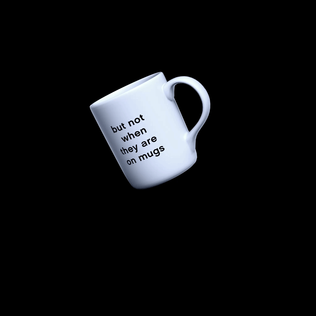
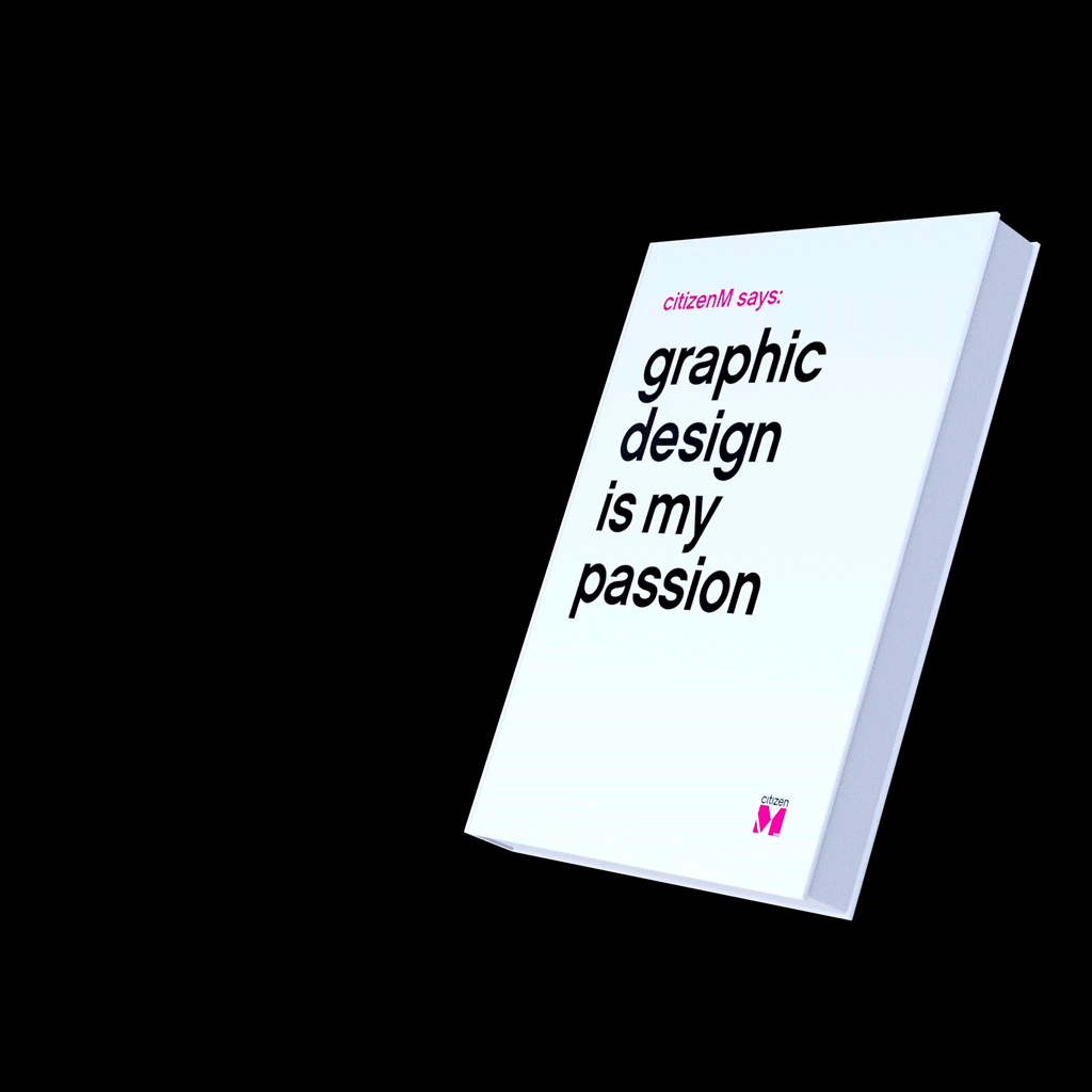
We created the entire site structure and brand narrative which we brought to life through a series of bespoke 3D icons. The guidelines were the guidelines. We created them, but they’re not that exciting.
Check out the site here.
When the site went live we took visitors though the design philosophy we’d created for them, illustrated with bespoke animated icons.
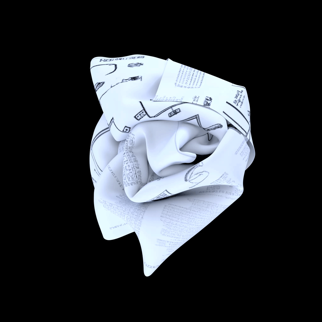
The guidelines themselves we’re brought to life with animations and the bespoke icons.


We launched with a holding page which game visitors the opportunity to play with key band assets, the citizens that we created to represent different types of guests.
Included was a history of the brand with key moments, campaigns and distictive assets from the 15 or so years.

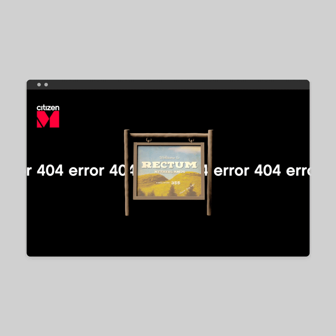
We then had a little fun with the 404 page which referenced one of the smallest towns in the Netherlands called Rectum.